6.08.2012

Before & After week!

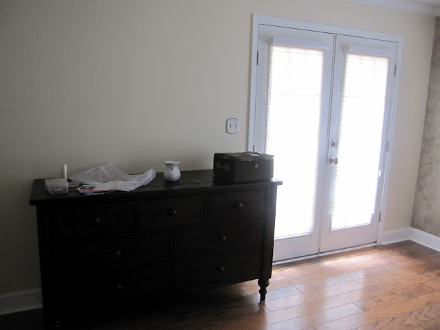
Before & After Photos are my absolute favorite...SO I am adding a few more! I think it's really helpful to see where we started and even though some projects are on a budget, we can truly make a space wonderful for our clients. This project was with some of my favorite clients. I really adore these two. They are a fabulous couple and due to their very stressful professions, they have not had time to do a whole lot of updating. So here is where we started in their Master Suite....


 and here is the end result...


We also had the opportunity to completely renovate their Master Bath...


The end result...


Where did we grab the good stuff?

Master Bedroom:
Ceiling Paint-Benjamin Moore Davenport Tan
Wall Paint-Benjamin Moore Shaker Beige with Lenox Tan ceiling accent
Ceiling Fan-Home Depot
Bedding-Calvin Klein Oxidized Paisley at Macy's
Chaise-Macy's
Rug and Draperies/Hardware-Pottery Barn
Lamps-Home Goods (Replaced shades)
Art above bed-Crate and Barrel

Master Bath:
Field Tile-Floor & Decor
Accent Tile-Specialty Tile in Miami Circle
Cabinetry-Custom design
Lighting above sinks-Home Depot
Mini-chandelier-Ballard Designs
Art-World Market
Knobs-Anthropologie (Best knobs ever...BTW)

Enjoy!
Chelsea


6.06.2012

Before & After: Master Bedroom

I know that I have been a terrible Blogger recently....mostly because I am pretty sure that I haven't posted in MONTHS!! Things have gotten a bit crazy for me this year (in a good way---being busy is awesome!) so I have been neglecting my blogging duties. Many apologies!! I promised some Before & After shots. So I will post some of my more recent projects over the next few entries. My dear friend and VERY talented designer Sabrina Kwon (Wabi Sabi Studio) and I collaborated on this project. The client is Oh-so-happy with the end result...and so are we!


The Warde Residence: Before


The Warde Residence: After


Want to grab some of our ideas??
Bed: Existing, but was purchased from Pottery Barn
Chaise: Existing, and was purchased from Crate & Barrel
Closets/Armoires: IKEA
Nightstands: West Elm
Rug: FLOR
Side Chair: West Elm
Dresser: West Elm
Draperies: West Elm
Sunburst Mirror: Ballard Designs
Lamps: West Elm
Art & Accessories: Crate & Barrel
Mirror: ZGallerie
Fan: Home Depot? Sabrina actually had this one lying around her house and thought it would look great! Yup, she is a genius:-)
Paint: Benjamin Moore Northampton Beige (careful, it goes a little purple--but was a great choice for this space!!)

Happy Shopping! XX
Chelsea

P.S. I just updated our website...check us out!


LIVE OUT OF STATE? Check out our new (and very exciting) Living Chic Boxes! Love this!


11.28.2011

Accessories....

Hello my favorite design-people:-)

I have been wrapping up a bunch of projects lately. This is great because it means that I have a lot of before&after pics headed your way! One of the final steps in wrapping up a project is the most fun...accessories! It seems that most clients are intimidated by buying and placing accessories. I agree it's a tough part of a project, but no room is complete until the final pillows, artwork, candles etc. have been placed.

I should add that most of my designer friends would argue that this is a very "decorator-esque" post, and I agree. However, it is a key part of being a residential designer.

Here are some of my favorite accessorizing tips:

1) Buy, buy, buy. Charge that card baby! Don't look at the price-tags and stress about how much you are spending. Go to some of your favorite stores and start piling up what you love! You will find a spot for it! I typically purchase double what I actually end up using in the space. Sometimes you will be surprised at what you use and what you don't.

2) Start out at the discount stores. TJMaxx, Home Goods, Marshalls, Ikea, Ballard Backroom, Target and Walmart. I always start here. I am constantly amazed at the products I find at half-price, that I saw at ZGallery and even Restoration Hardware....

3) Only purchase accessories from retail stores. Some of my favs are Zgallery, Pottery Barn, CB2, Crate & Barrel, and West Elm. This is important, because you can always return what doesn't work in your space.

4) This seems obvious, but try to vary your objects. Try to avoid "candle-land" or "picture-frame-land". Add in a clock, go for the funky elephant, add a wood sculpture, grab the bright blue vase.

Ceramic Owls

5) Buy in 3's and 5's. Items typically look better in odd numbers.

Decorative Bowl Wall Art

6) Add texture and pattern. Grab some nubby baskets, add a furry pillow, or a colorful striped rug.

Oversize Seagrass Basket

7) Mix and Match. I have 5 pillows on my sofa. None of them match, but they coordinate. Take 1 floral, pull out the blue color in the florals with a solid pillow. Add a white pillow, then pull in a stripe that coordinates with everything else.

Kantha Quilted Pillow

8) Rugs and drapes are expensive, but no room is complete without a rug and drapes. Save on cost by purchasing your drapery hardware from Target.

Silk Grommet Window Panel

9) Don't buy a piece of art unless you love it. You have to stare at that artwork every single day...love it! Check out art.com and find a print of a piece that you love. You know those great maps that they are selling at Restoration Hardware...they cost over $1000. Find a map on art.com and they will frame it beautifully for under $200.

10) Go big or go home. Don't buy teeny, tiny little accessories. Buy big impact items that become a focal point of the room.


11) Plan out your frame walls. It's difficult to put together a family wall...here is one of my favs.


Last piece of advice is if you are still feeling overwhelmed, hire a designer. Myself and a lot of designers will accessorize your room at an hourly rate. It's pretty time consuming and difficult to properly accessorize a space. A lot of my clients have great taste, but they are short on time. You can save a lot of time, energy and money (yes, money---designers get great discounts!) by hiring a professional. Let me know how I can help!

XOXO,
Chelsea

11.16.2011

Interior design earns dual No. 1 rankings by DesignIntelligence

I am so excited to announce.......

SCAD's interior design department has earned two No. 1 rankings for its undergraduate and graduate programs from DesignIntelligence's 2012 edition of "America's Best Architecture and Design Schools." It is the first time in the ranking's history that one university has received top honors for both undergraduate and graduate programs.

http://www.scad.edu/news/2011/design-intelligence-interior-design.cfm

So proud to have gone to such a fantastic school!

XOXO,
Chelsea

11.09.2011

Interlaken

As promised, I have pulled together some of the fantastic photography that my mom (aka. Amazing photographer/graphic designer extraordinaire) took on our trip to Interlaken. This is truly one of the most beautiful cities in the world. It's almost difficult to focus on the architecture throughout the city because the views beyond are so spectacular. Enjoy!


My mom and I dipping our toes into the freezing cold water...


Cheers,
Chelsea

10.19.2011

Switzerland, France, and Germany: Post 1

Hello All,


First, I have to apologize that my blog has been completely neglected while I have been traveling. I have been in and out of the country for the past month or so. My wonderful husband, Reese is doing a lot of work in Basel, Switzerland so my mother, Baby G and I ventured over for a couple of weeks. Basel is located at the very top of Switzerland and is about 15 minutes to France and 15 minutes to Germany. We took full advantage and visited the following cities:


Zurich, Switzerland
Colmar, France
Freiburg, Germany
Strasbourg, France
Interlaken, Switzerland
Lake Lucerne, Swintzerland
Wein am Rhein, Germany


Architecture and Design in Switzerland is of course a fantastic mix or ultra-modern and antiquated buildings. Here are a few images from our trip:


This was Colmar, France. Next post, Interlaken.


Cheers,
Chelsea